Liip Rebrand
Responsibilities
Brand Strategy, Brand Design, Stakeholder Management. Creative Direction, Digital Art Direction, UX/UI Design.
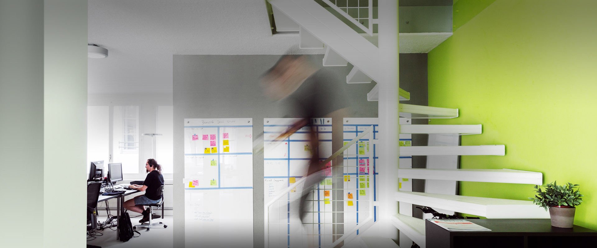
Liip stands apart as a leading Swiss digital agency. With offices across five cities, they deliver top-tier digital solutions with a strong focus on agile methodologies, self-management, and sustainability. The self-organized culture is driven by innovation, principles, and purpose.
My Role
I took on the internal role of Brand Strategist and Brand Designer while I was employed at Liip. I worked together with two other Brand Designers to create the rebranding identity for Liip.
Together we formed a Brand Design squad, set budgets and timelines with milestones and deliverables. We also clearly defined our roles and accountabilities for the project.
All Rights Reserved Liip AG
Agency | Liip
Published | 2020-2024
Designers | Jérémie Fontana, Alice Fada
Unconventional Branding
Liip Rebrand
Project Name Liip AG
Client 2024
Date Brand, UX, Design System
ResponsibilitiesAccording to Frederic Laloux, author of the book Reinventing organisations, a “Teal” (self-organised) company does not have a strategy! They don’t have brand positioning or even care what competition does.They are guided by their purpose and figure things out on the fly.
Problem
How might we develop a long lasting brand identity without traditional market research, competition data and a long term strategy?

Solution
Focus inward on self awareness and externally on the target audience to develop our own framework for decision making and staying true to the brand.

Brand Research
The journey inward began with in-depth research. Interviews with the founders, an exploration of Liip’s history, sifting through old archives. I documented my findings in a visual timeline. This allowed me to see the evolution of Liip’s visual design and communication year by year and recognise patterns.
Timeline Segments
1. Core messages, and claims
2. Snapshots of the website
3. Primary & secondary brand elements
4. Image worlds and later illustrations

Key Elements
My research distilled Liip’s essence by identifying recurring patterns to determine which elements should be carried forward and which should be left behind. One key insight was that blog posts had been a prominent part of the website since 2007.
Another key discovery was that, aside from black and white, green had been the only consistent colour from the company's inception to the present day.
The Logo
The double slashes // were in the logo from the start. They were simple, unique, had meaning, and are highly recognisable. Used alone as an icon or as the letters ii in the logo type for Liip.
The Colour
Over the years the colour green had transformed into a very digestible yet bland version of green. It was practical and versatile but lacked character. The original green was vivid and memorable.
The Font
I wanted to change the font. My top choices were Akzidenz-Grotesk, Univers, or Neue Haas Grotesk. We kept the font Archivo for a number of reasons. There is always a design compromise, this was mine.
Brand Spirit
Through my research I uncovered the 3 pillars of identity that defined Liip as a company and shaped the culture and ethos of the company.
I also uncovered data that indicated the largest area of investment for the company had been in sustainability over the last five years.
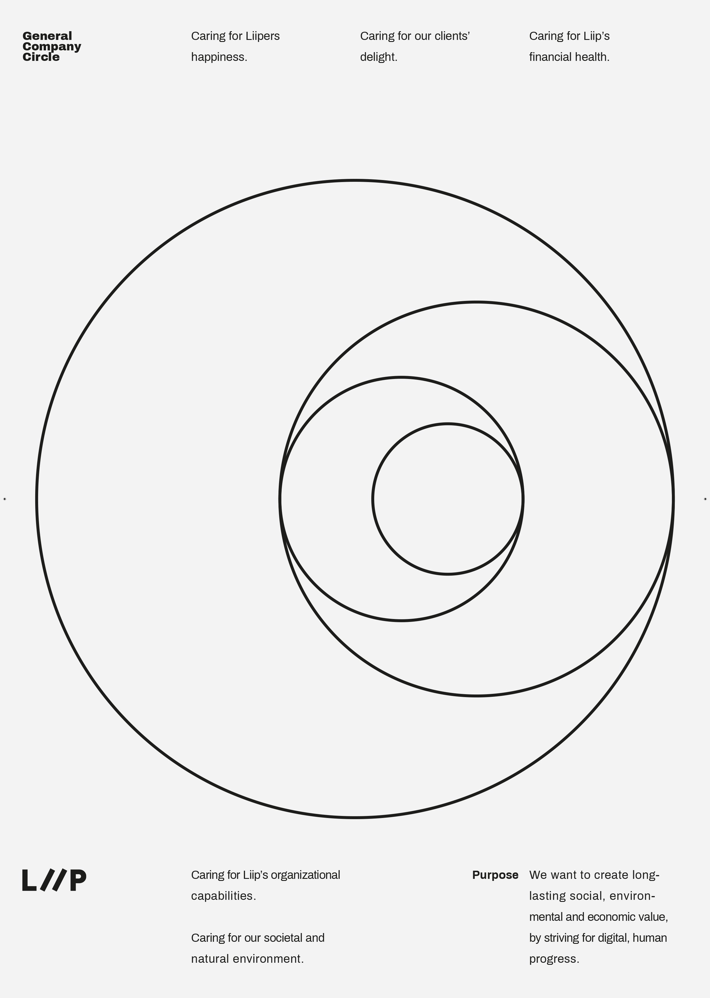
Purpose - The Why
A broad and far reaching statement why the company exists.
Principles - The How
Behaviours and characteristics that employees should aspire to live up to.
Priorities - The What
Ever evolving short term strategies to focus efforts and align thinking.


Design Explorations
Examples of my early design explorations that did not make it through the decision compass filter. The designs were either left behind or adjusted to be in closer alignment.


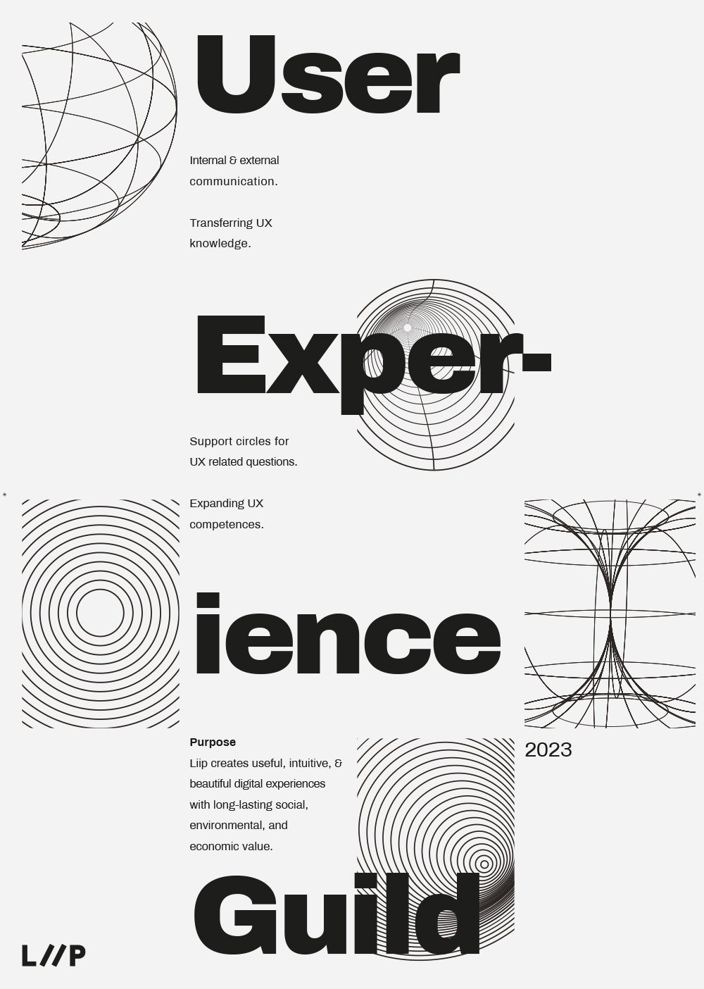
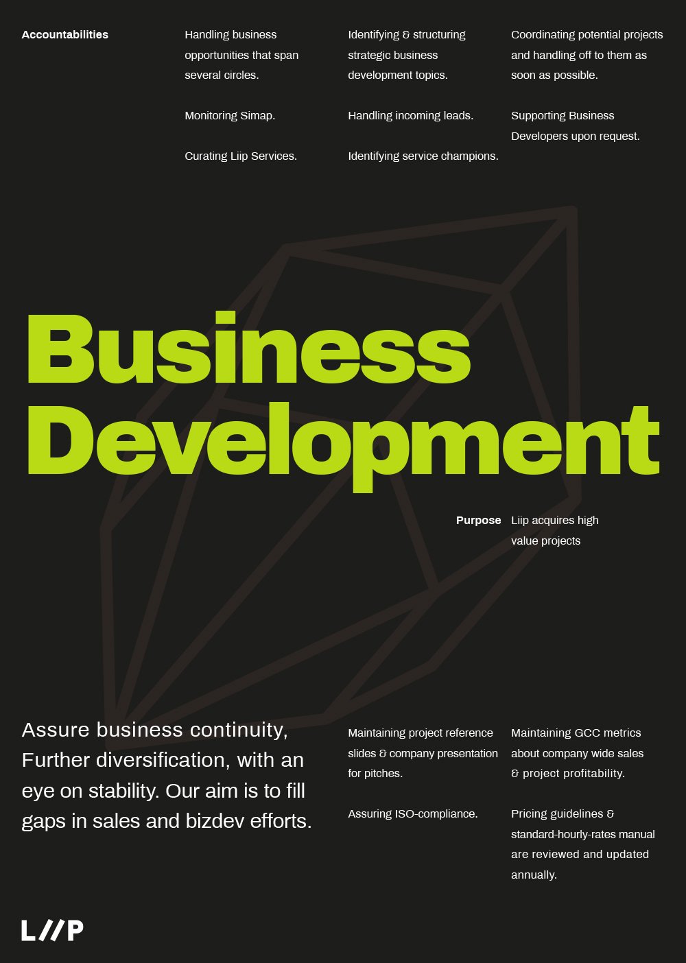
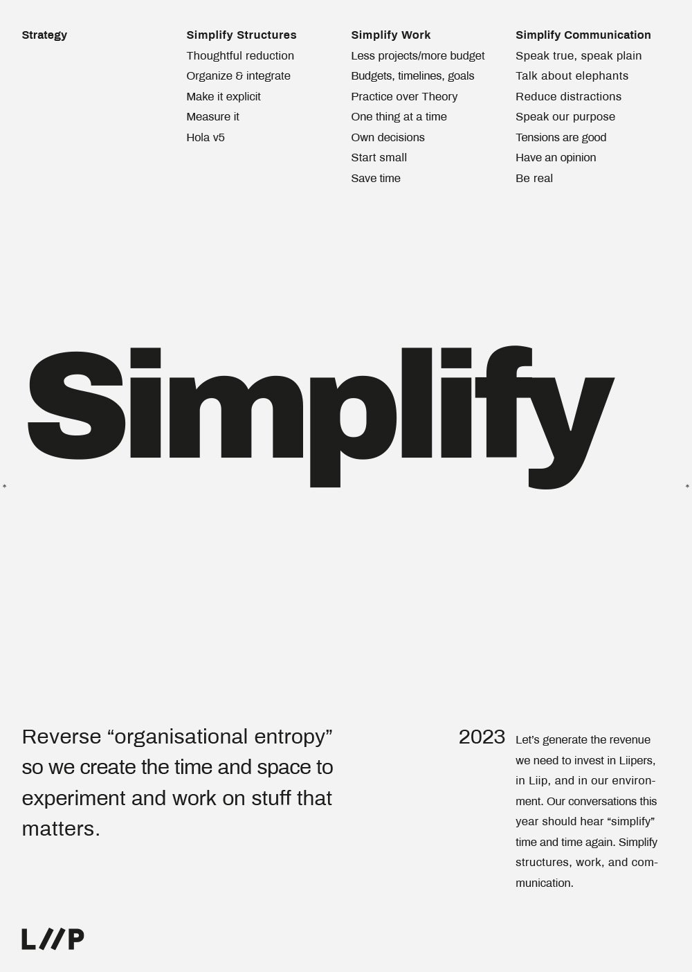
Brand Design
The building blocks of the redesign: Logo mark, Colour palette, Typography, Image World, and Motion Design.


Infographic Design


Interface Design
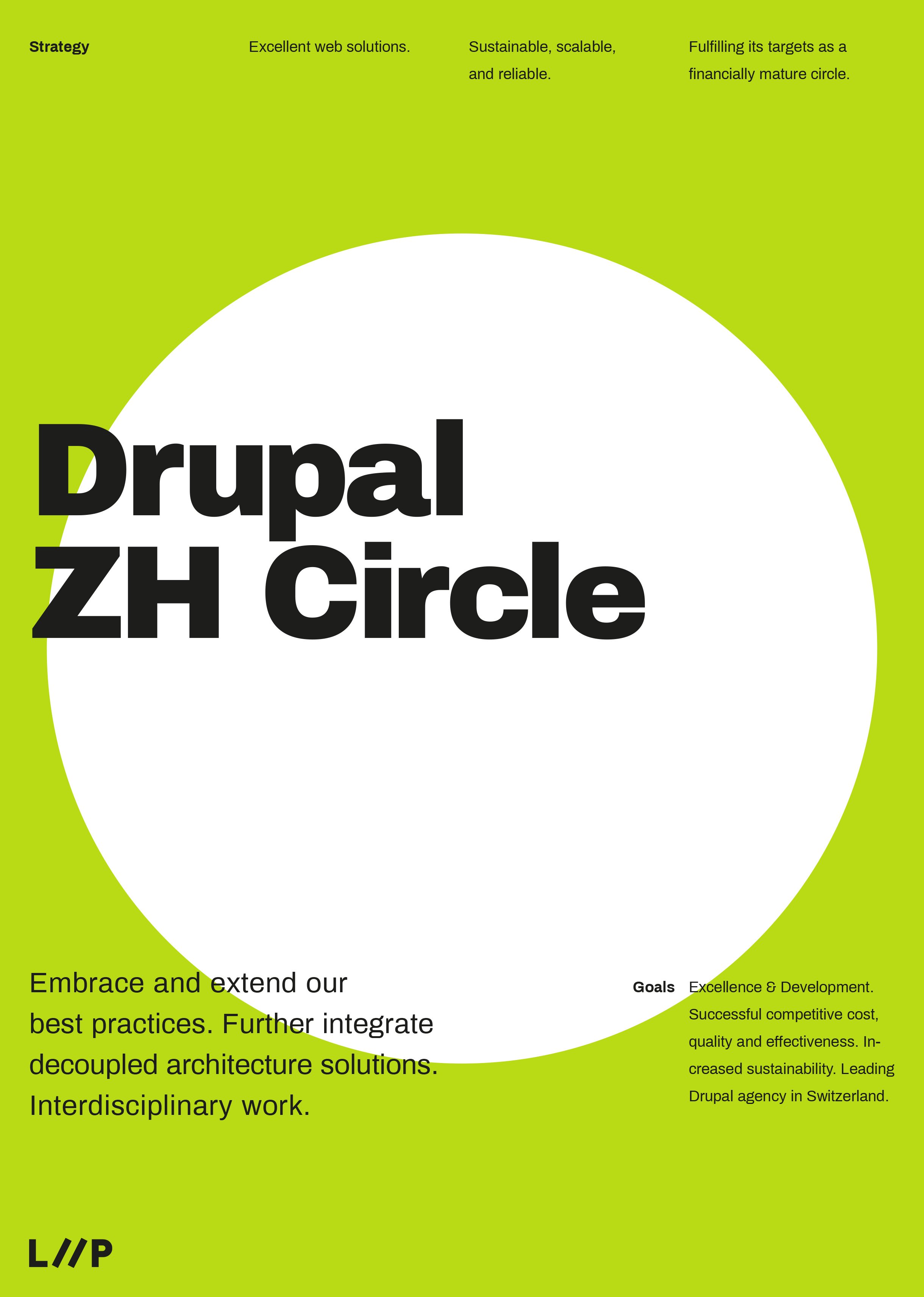
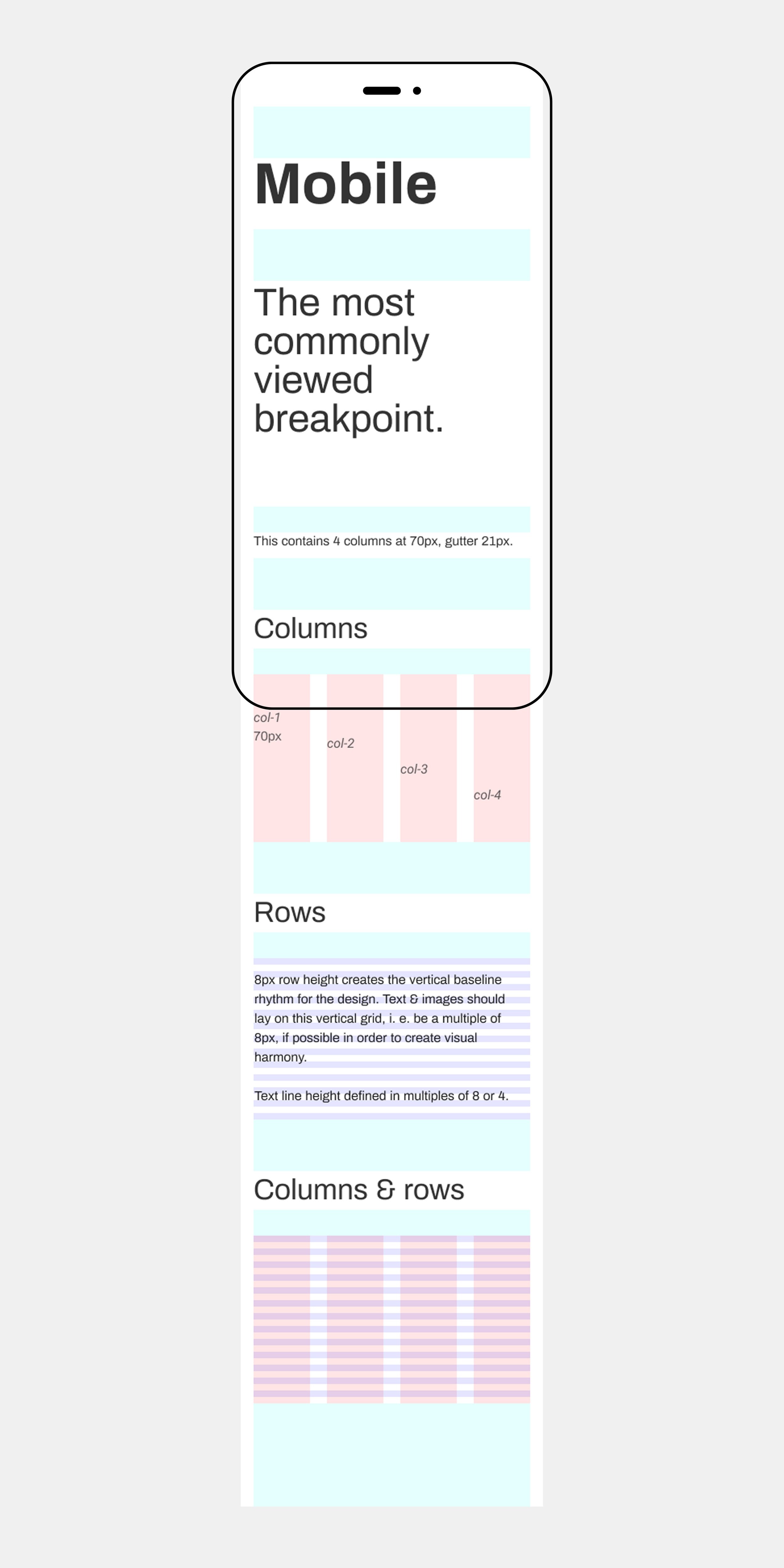
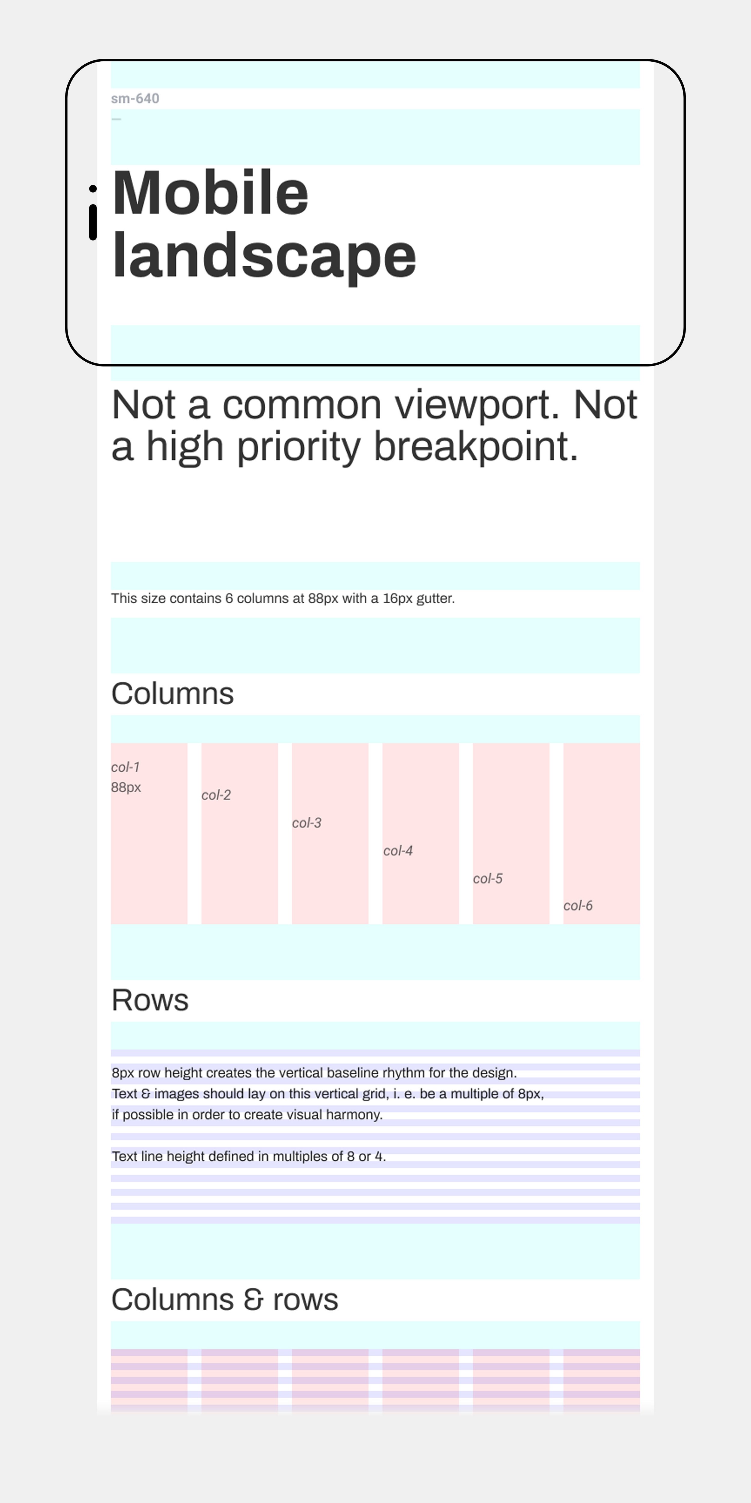
I was in charge of creating the new UX/UI design which was Liip’s most important brand touchpoint. I created a proper grid system for the layouts.
Then typographic system for the bold refresh. I radically eliminated images to reduce file size and make the website more sustainable.


RebrandingTakeaways
1. Agile Branding
Creating a small, skilled, and specialised team can allow rapid iterative design work. When there is little bureaucracy involved progress can be made quickly.
2. Authentic
Looking inward towards the history of a brand is helpful to see a path into its future. Identifying the brands key elements and spirit are major milestones in creating a strategy.
3. Sustainable
The current market trend is moving towards more sustainable brands. Better business practices and ethical products are becoming a requirement for every brand strategy moving into the future.